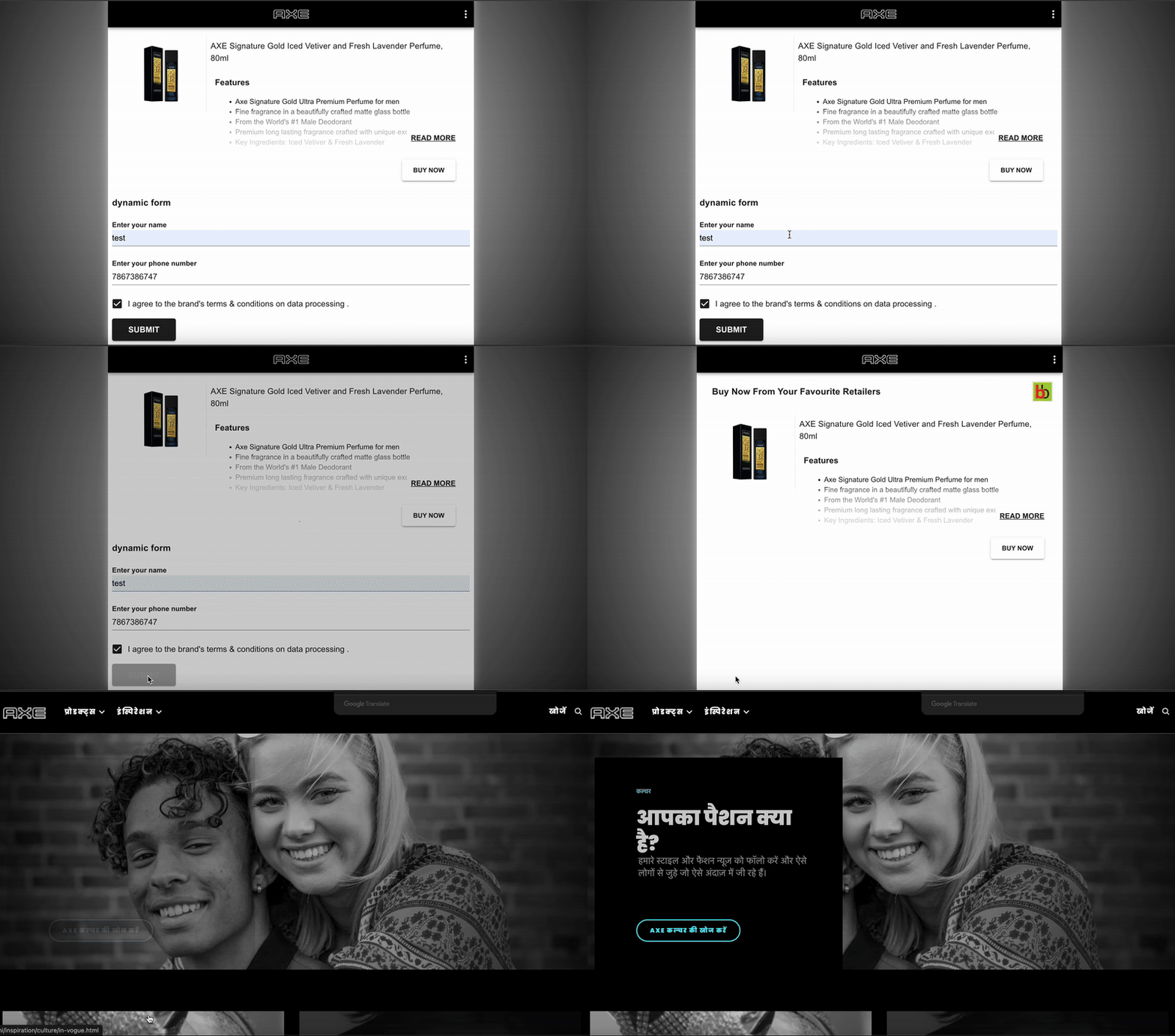
The Shopalyst Experience Builder offers a powerful and flexible form builder designed to create PII (Personally Identifiable Information) forms.
The formbuilder allows us to create online forms for collecting data and feedback from customers. It serves a variety of purposes such as surveys, event registration, order forms, and more.
You can also create MultiStep Form - Ideal for simplifying long forms, click here to know more.

There are multiple new field types added to the FormBuilder to capture user feedback effectively. Below are the fields
Text: The text field is used to input free-form text or a short sentence. This type of answer is commonly used for questions that require a brief response or a simple explanation such as name, address, etc.
Number: The number field requires numerical input from the user. This type of answer is commonly used for questions that require a quantitative response, such as age, weight, or a numerical rating.
Email: The email field requires an email address input from the user. This type of answer is commonly used for questions that require a user's email address for account registration, newsletter signups, or contact forms. This field also ensures that users provide a valid email address that can be used to communicate with them in the future.
Mobile: The mobile field is used to input the mobile phone number of the user. This type of answer is commonly used for questions that require a user's phone number for account registration, event invitations, etc. This field also ensures that users provide a valid phone number that can be used to communicate with them in the future.
Date selector: The date selector field requires date input from the user for age verification, event registration, or appointment booking.
DropDown: The DropDown field will have multiple options to select from. With a dropdown answer type, respondents can select one option from the list.
Single select: With a single select answer type, the user can only select one option from the list.
Multi-select: With a single select answer type, the user can select multiple options from the list.
Image upload: With an image upload answer type, respondents will be able to upload an image file in jpeg/png format
Label: The label field is the title you want to display for a form field.
Rating: The rating field enables users to provide feedback on a product, service, or experience by means of emoticons. There is an option to use a combination of 3 or 5 emoticons to capture the feedback.
Scale: The scale field helps the user to move the slider to select their ratings. The maximum and minimum ratings can be configured from experience module.
Location: With a location answer type, respondents can either manually enter their location or allow the form to access their device's location to automatically populate the answer.
Prevent repeated form submission with user uniqueness checks
The form builder now allows you to mark specific form fields to be used for checking if the form has been submitted with the same data earlier.
The following example shows how you can mark a field for an email to be used for checking duplicate submissions.

Ensuring Security and Flexibility with Shopalyst Experience Builder
For enhanced security, OTP validations can be enabled, provided the customer supplies access to a text messaging gateway via its API. However, due to legal constraints, a Shopalyst-contracted gateway cannot be used by brands to send text messages on their behalf.
The form builder also supports the inclusion of custom consent messages, which can be configured as mandatory or optional based on the requirements. Once users submit their data, several post-submission actions can be triggered, such as:
- Redirecting to any specified URL.
- Displaying an image.
- Distributing coupons, either as a static code or from a predefined list.
- Showing a clickable button after a set delay.
With its versatility and user-friendly features, the Shopalyst Experience Builder simplifies PII form creation while ensuring compliance and a seamless user experience.
Get your Dynamic form page redirected to an external link directly:
You can configure the PII form to redirect users to an external link, bypassing the Thank You page.

For any dynamic form related customisation please reach out to Shopalyst support team. Instructions to reach out to support are here.
